Basics of website UX
The UX field is vast and there are many concepts. This article is a summary of the basics of User Experience (UX) and related fields that’s a good to know when working with websites.
Who is this for?
For anyone wanting to:
- Proactively spot errors on their own websites.
- Be able to critically review design, copy, and dev proofs delivered by internal/external teams.
- Grasp the importance of scope and constraints of working on UX tasks and related areas.
What is UX?
These are key terms and areas I personally work with as part of UX audits and keep in mind for creating new pages and websites.
Definition: UX (User Experience) is how a person feels when interacting with a website or digital product. It includes usability, accessibility, desirability, and overall satisfaction.
Why it matters: Good UX leads to higher user retention, better conversion rates, and fewer support queries. For clients, this means happier users and better ROI.
What is ‘good UX’? Good UX ensures that users find, understand, and act on your content.
UX and other overlapping concepts
UX is interconnected with other disciplines. These overlapping topics that feed into, are affected by or in turn affect a website’s UX.
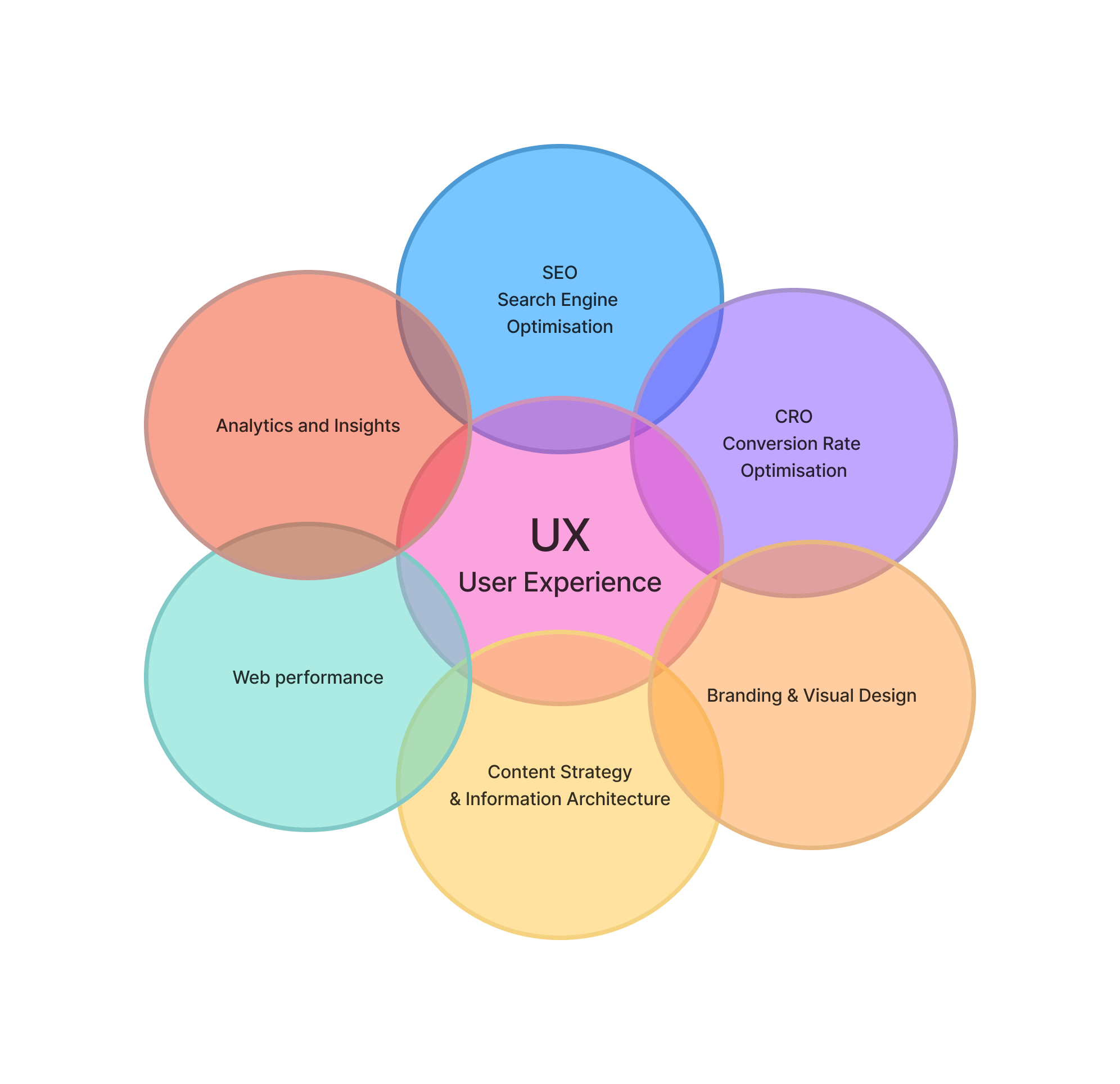
Search Engine Optimisation (SEO)
- SEO ensures that a website is discoverable by search engines and ranks well in search results, driving organic traffic.
- Modern SEO is user-centric. Google rewards sites that deliver a positive user experience, not just keyword stuffing or backlinks.
- SEO principles encourage clean site structure, fast load times, mobile-friendliness, and accessible content.
Sidenote: This is applicable for GEO (Generative engine optimisation = SEO targeted at AI and LLMs) as well.
Conversion Rate Optimisation (CRO)
- CRO focuses on improving the percentage of visitors who take a desired action (buy, sign up, contact, etc.).
- Successful CRO depends on an intuitive and frictionless user experience that guides users through a conversion path.
- CRO tests (like A/B tests) often identify UX improvements that benefit all users, not just those at conversion points.
Branding & Visual design
- Consistent, appealing design enhances trust, clarity, and emotional connection.
- Consistent colour scheme and placement of on-page elements.
This also impacts:
- UX → Affects first impressions and ongoing engagement.
- SEO → Good design reduces bounce rate, which can influence rankings.
- CRO → Visual cues direct attention and action.
Content strategy & Information Architecture
Good UX depends on clear, meaningful, and well-structured content. Content also drives SEO (keywords, readability) and CRO (messaging that converts). How users can navigate to and find content from other pages or menus.
This ties into the following areas:
- UX → Guides users smoothly through the journey. Ensures users can find what they need easily.
- SEO → High-quality, keyword-optimized content attracts search traffic. Clear hierarchy improves crawlability.
- CRO → Persuasive content increases conversions. Smooth pathways reduce friction to conversion.
Web performance
Website performance (load speed, responsiveness, stability) directly affects user satisfaction, conversion rates, and search rankings (via Google’s Core Web Vitals).
- UX → Slow sites frustrate users.
- SEO → Performance is a ranking factor.
- CRO → Faster sites have higher conversion rates.
Analytics and insights
Data helps identify UX pain points, measure CRO success, and assess SEO performance. Insights from analytics drive improvements in all areas.
Tools: Hotjar, Microsoft Clarity, Crazy Egg, PostHog, Google Analytics (GA), Matomo.
These tools can give quantitive (amount) information such as number of clicks on elements, which pages are visited, heatmaps of how page visitors scroll, as well as qualitative (in-depth) information from things like screen recordings to see how people act.
- UX → Understand real user behaviour.
- SEO → Refine based on traffic patterns and queries.
- CRO → Optimise flows and funnels.
Usability
How easy is the website to use?
Usability aims to answer the questions “How easy if your website to use?” and “How easy it is for users to complete their goals?”
People will leave if it’s too difficult to use or navigate around to find what they are looking for.
5-second test → Can you tell what the website is/does in 5 seconds?
Checklist:
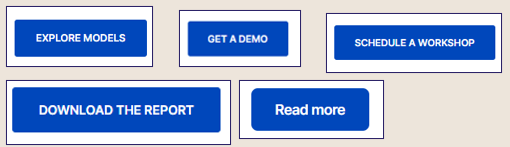
- Clear CTAs (call-to-actions)
- Simple navigation
- Web pages and navigation follow a logical structure
- Accessible forms
- Can users find what they need in 2-3 clicks?
Accessibility
Ensures that everyone, including users with disabilities, can interact with the site. This improves UX, expands audience reach, and can even impact SEO.
- UX → Fundamental to inclusive design.
- SEO → Alt text and semantic structure help bots understand content.
- CRO → More accessible interfaces mean more conversions from a broader user base.
Audit a website for UX issues
You don’t always need a big overhaul on an existing website to improve it. To do a quick UX audit of a website, here are my top high-impact areas to review.
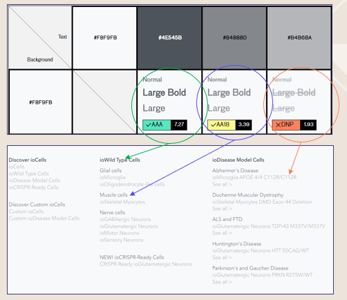
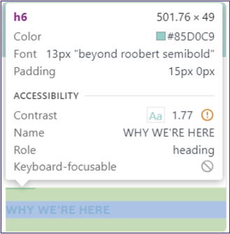
Colour contrast
Core question: Is text readable? Is the contrast between the text and background big enough to be legible? Look at things like headlines, sub-headlines, copy and navigations.
Grab the hexcode of colours with a plugin like ColorZilla or by looking at the source code.
Check colour contrast with a tool such as Use all five and screenshot the results.
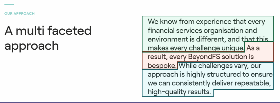
Copy
Core question: Is it easy to scan the page and understand what it’s about? We are looking for clear and descriptive headlines, a natural flow to the page and clear plaintext language.
Is it easy to:
- Understand what the company does?
- What they sell?
- Who their target audience is?
Even “mature” industries can be clear in their copy and avoid abbreviations and overly complex wordings.
Copy-paste the text into a readability checker such as the Heminway app.
Images
Core question: Is everything looking alright? Any glaring errors? Are we missing alt text or descriptions?
Contextual descriptions of the image should be added to any graphic that isn’t a reusable icon (e.g. the company logo) through the use of alt text.
For even better SEO-points, the image file should have a descriptive name as well. Compare:
- office-time_0152-scaled-e160330074322.jpg
- two-consultans-discussing.jpg
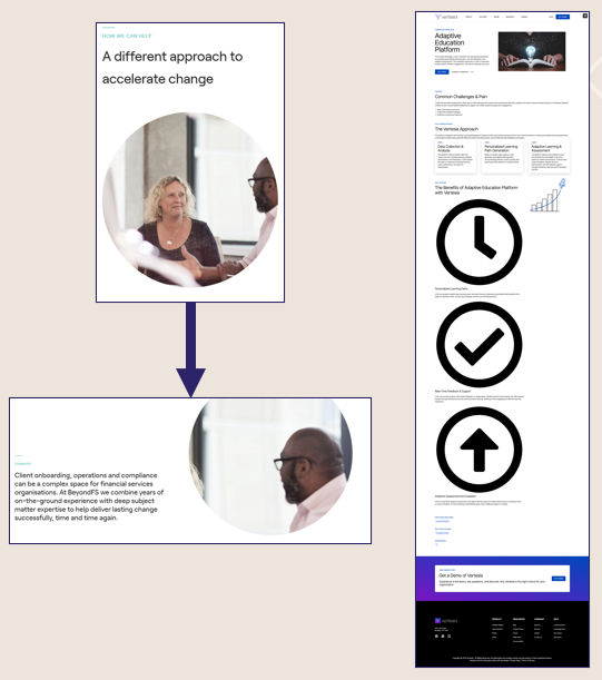
Visual design and interacting with elements
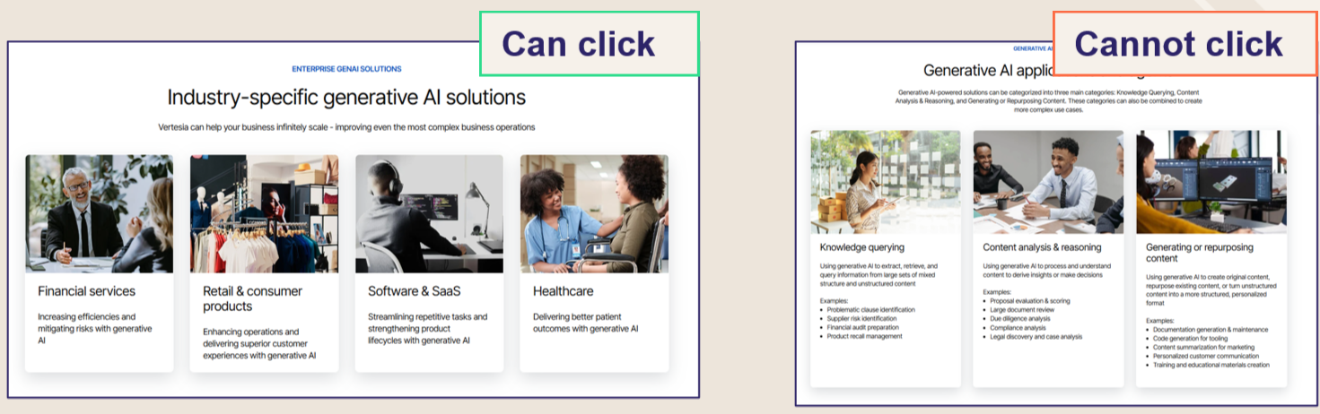
Core question: Is the visual design consistent between pages and elements of the same type? Is the way these modules look and behave consistent and predictable?
Some websites have layered modules and designs on top of each other, resulting in a visual messiness where it’s not clear what’s going on. It could be buttons of different sizes, unpredictable placements with a module/section, big differences in pageflow between pages of the same type.
Other websites have a tight design, but lack in predictability. We don’t want the user to have to guess “what happens here?” or “how should I use this?”.
Navigation (main and footer)
Not every page needs to be accessible from the navigation.
Core question: Can a user interact with the main and footer navigation easily? To see all options and go to where they want to be?
Do we have visual indicators of what page you are currently on, where your mouse is hovering, if there are more options beneath a headline?
Are the groupings of navigational items easy to understand?
Information architecture
Core question: Review if the site structure makes sense.
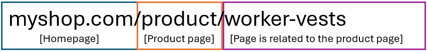
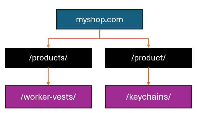
The homepage is at the top, which links to high-level (and topic-specific) pages such as solutions and products.
Beneath these topics, there may be subpages connected to the topic page.
Gathering pages on the same topic along the same “route” is an excellent way to ensure that website crawlers comprehend their relationship.
This relationship between pages is established through the structure of the URL, with parent pages preceding subpages in the slug.
Why is this important? This top-down hierarchy aids site crawlers in comprehending and categorising the relationships between pages, and ensuring they pertain to similar topics.
Tips & Tricks on how to conduct an audit
Eyeball it
Start off by doing a quick scan before delving deeper into specific pages and issues. What are your gut reactions and feelings?
Apply “filters”:
- Would my grandmother understand this?
- Would someone in the target audience be able to quickly grasp if this is a service/product for them?
- What do I understand from scanning the headlines and not reading thoroughly?
- What can I be confused about?
- What would I expect to happen if I click this link/button/thing if I didn’t know anything about marketing?
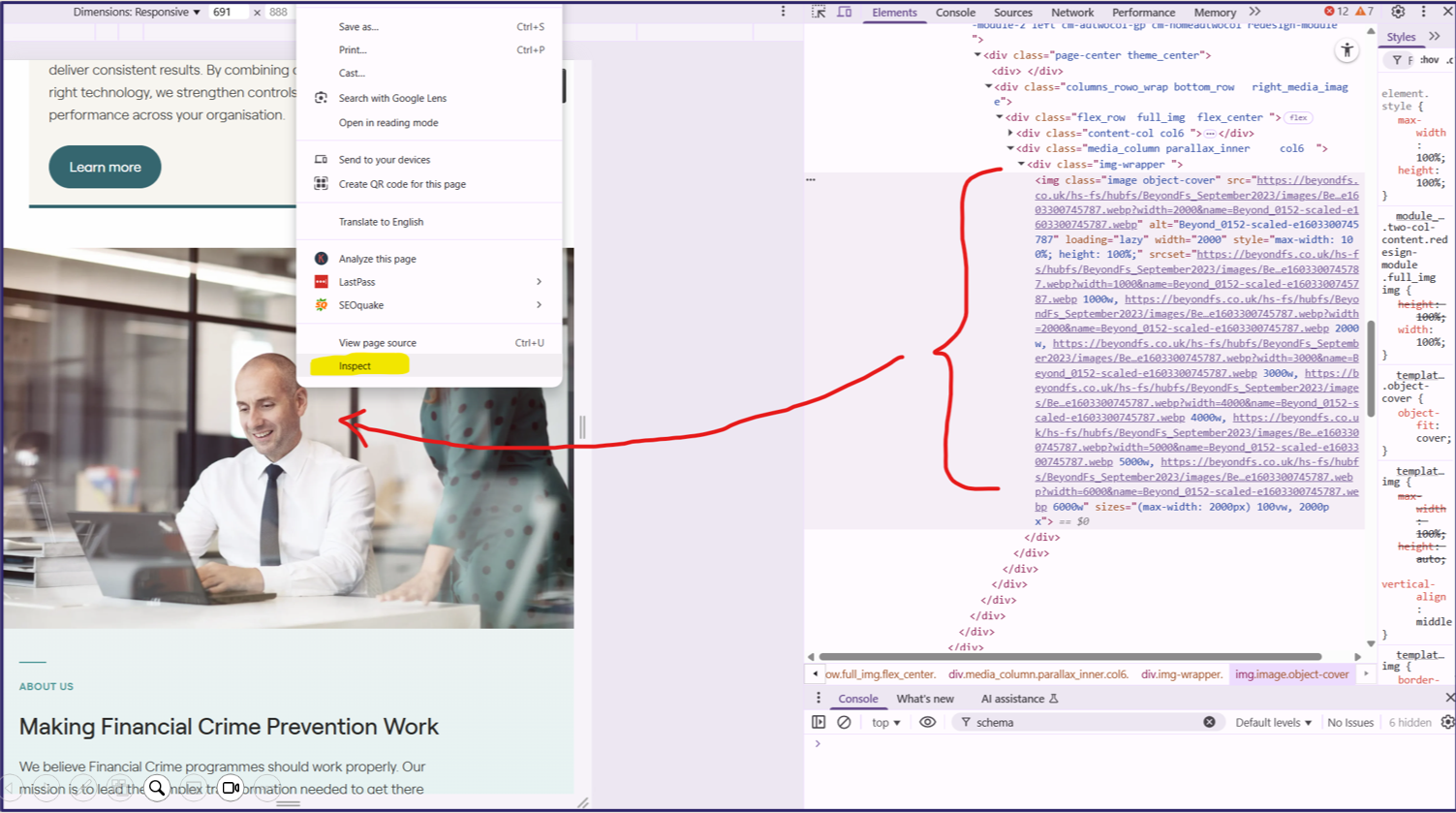
Inspect the page code
By looking at code, you can see things like image settings (alt text and file name), font settings and other code related things.
Being more familiar with HTML and CSS (and JavaScript) will give you more information from looking at the code.
</figure>
</figure>
Mobile vs desktop
Review the website on both desktop/laptop and mobile.
You can either whip out your own phone to compare (send screenshots to yourself) or resize the window.
Websites are often developed for desktop and resized for mobile (it ought to be the opposite, scaled up with functionality added). This can cause issues the clients aren’t aware of such as:
- On-hover with mouse functionality not working at all on mobile (tap = clicking)
- Sizing of elements being incorrect
- “Stacking” of elements (image/copy) behaving oddly
The UX audit process
So, what order should you apply all of this in?
1. General observations
Most of what we’ve covered so far in the concrete examples above. It should reveal quick wins and structural issues that impacts the website as a whole.
This rests on first hand observations and doesn’t require extra analytical tools. 3rd party websites can be used to do the analysis of colours, readability or accessibility.
Outcome: A checklist of todos to fix smaller/bigger issues and work through other improvements.
2. Information architecture (IA)
While doing a general review, the IA will naturally come up as you are looking at the navigation and looking through pages.
This is a deeper dive into how the sitemap is laid out with the relationship between pages and their topics.
This feeds heavily into SEO and impacts the navigation with the grouping and presentation of pages.
Outcome: Spot necessary changes to the URLs, merging or splitting pages or grouping of pages in the navigation.
3. Deep dive into specific pages
Diving deeper into specific pages. You should prioritise converting pages and ones close to the final steps of conversion: contact us, demo, homepage, product page, services explainer, pricing page.
This review is usually aimed at refining the page goal - the “what happens next?”. Eg. if the goal is for the page visitor to book a demo, the deep dive looks at the information on this page to see how well it supports this goal.
We usually want to review heatmap data or watch session recordings to see how real humans interact with the pages. This overlaps heavily with CRO (conversion rate optimisation) to improve
Heatmapping software to show clicks, scrolls and screen recordings are of great help to identify friction points to solve.
Outcome: Copy updates, redesign of page elements, changing the messaging or positioning, revising the page flow (order of elements).
4. Review with specific goals in mind
Review the website and page elements (general and deep dive) from a specific angle to look for improvements.
Eg. Increase trustworthiness or positioning to investors and end-users.
Outcome: Introduce new on-page elements, pages or visuals to support this end-goal.
5. Customer Journeys
While stepping into the shoes of a website visitor / user / customer is important for review, looking at customer journeys is a slightly different task.
This aims to see how different types navigate between pages to find their desired information or achieve their goals (the purpose of visiting your website).
This can either be a review of the conversion paths (overlapping tasks with conversion rate optimisation), or a review of how users move from one page to the other within a site.
This requires more preparation than the previous steps, as we’d ideally know:
- Target audiences → the user groups who would be getting visiting this website. A CEO and a teacher’s assistant would likely look for different information and have different needs.
- How they will use the website → to find information or buy something. Find technical specs to provide another internal stakeholder. Lots of options
- The buying journey of the target audience → knowing at what point the customer is engaging with the website and what they need to get out of it is helpful to make sure the right conversion points or information are there.
With this in mind, review the website to see how the groups of page visitors may navigate across the website to find what they need to, and do what they came there to do.
Outcomes: Identify missing information or on-page elements. Improve conversion paths and navigation around the website.
6. Conversion paths
While customer journeys will look at general ways users navigate across pages and look for information, this aims to look at specific pages that are part of the funnel to convert to seek improvements. Seek out and solve friction points (things that are stopping people from converting).
Reviewing a path/funnel as a whole takes more time than pages in isolation. You can look at a page like Pricing to determine how well it converts on it’s own as part of general observations (is there a call-to-action, is the pricing structure clear, is there a next step). Here, you’d look at that page as a part of the lineup of pages a customer looks through on the path to the final goal (book a consultation) to see if it contributes to the overall goal.
Outcomes: Streamline informational journeys and conversion points.
7. Path exploration & other data
Look, you should be grounding observations in data. I’m not often in a position where my clients have enough data (low volumes or no tracking at all) so focus quite heavily on UX best practice for the audit and only bust out the data step now.
If there is Google Analytics (GA) or a similar tracking software installed, it’s time to bust out the reports.
In GA there is a specific report called path exploration that can show you how users move between pages. This’ll give insight if they tend to follow the intended funnel, or move in other unexpected ways… meaning you’ll need to look at changing elements so they do follow the intended funnel, or beef up the path so it’s more helpful.
Outcomes: Identify areas of improvement.
Package it visually - and improve
To wrap things up I’ll finish off by saying that it helps to take plenty of screenshots and put it all in a document like a slide deck or interactive whiteboard. This allows you to categorise errors as you spot them and more easily have something to work from when it’s time to tackle improvements.
Good luck!